Responsive design is no longer a nice extra feature. In 2026, it is a basic requirement for a business website.
People move between phones, tablets, laptops, large desktop monitors, and everything in between. Your website has to work well across those screens without forcing visitors to pinch, zoom, hunt, or fight the layout.
A responsive website adapts to the visitor's screen size while keeping the same content, purpose, and conversion path intact. That last part matters. A site is not truly responsive just because the text shrinks and the columns stack. It still needs to help the visitor understand what you do and take the next step.
The Beauty of Flexibility
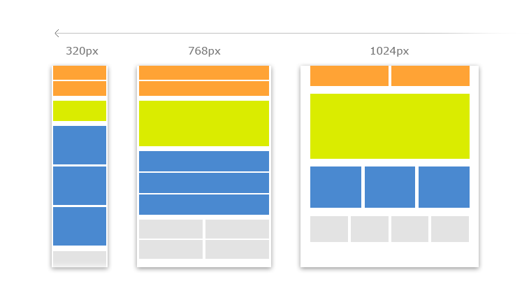
Responsive web design gives you the opportunity to have one website that can flex across different screens and devices.
Instead of building a separate mobile website next to your standard desktop website, responsive design lets you maintain one site, one set of URLs, and one content structure. The layout changes based on the screen size, but the website remains connected and easier to manage.
That is better for users, better for maintenance, and better for search engines.
The goal is not just to make the website fit. The goal is to create a strong experience on every important device. Phone visitors should be able to read, navigate, tap buttons, fill out forms, view images, and understand your offer just as easily as desktop visitors.
How Does Responsive Design Work?
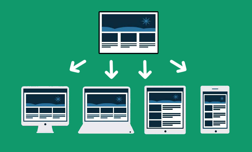
Responsive websites are built with flexible layouts, flexible images, and CSS media queries.
The layout can adjust as the screen gets wider or narrower. Images can resize instead of breaking the layout. Navigation can change from a desktop menu into a mobile-friendly menu. Sections can stack, resize, hide decorative elements, or reorganize content so the page still makes sense.
CSS media queries are one of the main tools developers use to apply different styles at different screen sizes.
.service-grid {
  display: grid;
  grid-template-columns: repeat(3, minmax(0, 1fr));
  gap: 2rem;
}

@media (max-width: 800px) {
  .service-grid {
    grid-template-columns: 1fr;
  }
}
That is a simple example, but the principle is powerful. The same content can be presented in a way that feels natural for the screen being used.
Why Responsive Design Is Critical in 2026
Google uses the mobile version of a site's content for indexing and ranking. This is called mobile-first indexing.
Google does not require a separate mobile version of your site to appear in search results, but it strongly recommends having a mobile-friendly website. Google also recommends responsive web design because it serves the same HTML on the same URL and is easier to implement and maintain.
This means your mobile experience is not secondary. It is central to how your site is understood, crawled, and experienced.
If your desktop site looks beautiful but your mobile layout is broken, slow, incomplete, or hard to use, you have a real problem. Visitors may leave, leads may drop, and Google may have less useful content to work with.
Responsive design matters because it affects:
- User experience
- Search visibility
- Lead generation
- Online sales
- Page speed and usability
- Maintenance costs
- Trust and credibility
Content Still Needs to Match
One important detail is that your mobile version should contain the same important content as your desktop version.
It is fine to change the layout. It is fine to move content into accordions or tabs to save space. But if you remove important content from mobile, Google may not have the same information available when it indexes the page.
The same idea applies to headings, metadata, structured data, images, alt text, and videos. Your mobile experience should not be a stripped-down afterthought.
Conclusion
The bottom line is that your website needs to adapt to the way your customers actually browse.
Responsive design helps you maintain one website that works across devices, supports Google's mobile-first indexing, and gives visitors a better chance of becoming leads or customers.
If your website still feels like a desktop site that barely survives on a phone, it is time to fix that.